|
Getting your Trinity Audio player ready...
|
If you and your organization have been contemplating a new brand identity or logo, make sure you keep the following questions in mind. We’re giving you 8 questions to contemplate, and – bonus! – 8 answers with a real life example from one of our clients, The O’Connor Group.
1. Do you really need to re-brand?
Take a really good look into what your current brand identity says about your brand as of this moment. Does your brand still represent what you want it to? What does your brand color and the fonts you use say about your business? Does your brand have a deep history with clients and connections? Do you need an entire overhaul or can you make some small tweaks that would modernize your brand and suffice?
In the initial meeting with The O’Connor Group, they had not changed their branding since their inception in 2007. It was unanimous that their branding looked old and stale, and didn’t represent their quality of work and the look and feel that they wanted. They also knew that none of their clients would have an aversion to this change. They wanted a complete branding overhaul, including logo, website, and everything their brand touched. (Full disclosure in case we make it look easy: the re-brand, logo, website, etc took hours of meeting, discussing, designing, tweaking, blood, sweat, & tears!)
2. What 3-4 adjectives describe your brand and what 3-4 adjectives describe your ideal brand aesthetic?
This is an important exercise that can be done by asking leadership, clients, team members, and anyone else who interfaces with the brand on a regular basis. After asking these stakeholders to put some thought into what the brand currently represents, they should discuss what the brand should strive to represent.
After working with and coaching The O’Connor Group, we landed on the following brand descriptors: trust, integrity, and quality. Their target brand aesthetic was clean, simple, fresh, and calming.
3. What colors and fonts represent your brand?
Humans can have a powerful response to color, so this decision should not be made lightly. If your brand already has a strong brand awareness, you may want to stick to the same color palette, however if your company want to send a message that it is the new and improved version of itself, a bold move with a totally redesigned look could work well.
The O’Connor Group fell into the second category mentioned above. Their brand was a little stale, and its colors didn’t match their desired brand personality. The decision was made to move away from maroon and gray and move towards the blue/green arena. Blue and green have a calming effect, and The O’Connor Group wanted people to feel that some of their problems could be alleviated by partnering with them. You can see in the contrasting logos below. The new logo is fresher, more exciting, and more modern-looking. Plus it has some other changes we will touch on below.
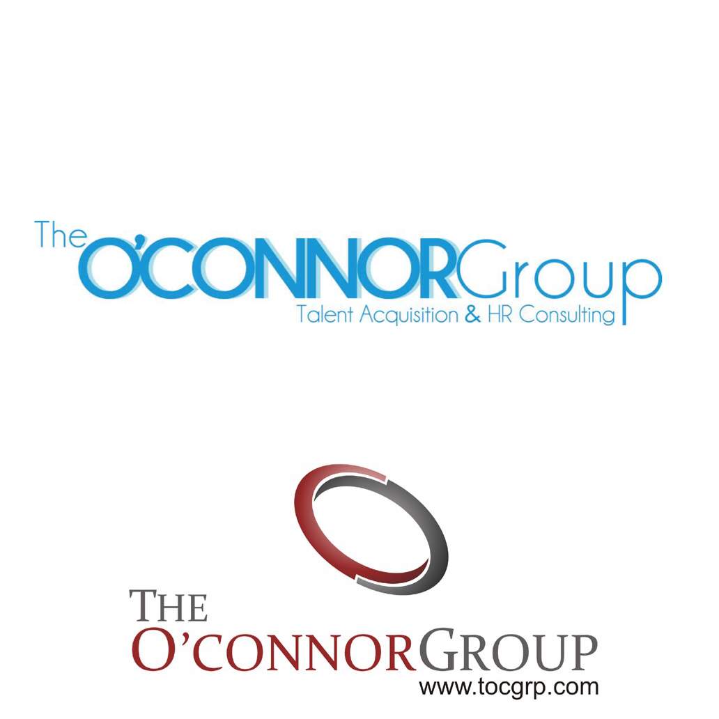 The O’Connor Group new and old logos
4. Do you want words or symbols or both as your logo? Which word(s) is/are most important?
Lots of brands have symbols that represent them (Under Armour, Apple, McDonald’s, Target) but brand recognition for those companies didn’t happen overnight. If a brand is in its infancy, it’s best to use the name either by itself or with a symbol/icon accompanying it. If you want to use a symbol only for your brand, it’s a lot easier to earn brand recognition first by seeing the symbol with the brand name and then dropping the name once awareness becomes universal.
For The O’Connor Group, the words “The” and “Group” were generic, so we wanted the focus on “O’Connor” since it’s the last name of the President of the company, and since it means something to their current clients and contacts. However, The O’Connor Group by itself didn’t mean much to someone coming across it for the first time. Was it a law firm, insurance sales group, real estate agents? Instead of using a symbol to accompany their name, (like their old logo did with an abstract O & C) we decided it was important to let the public know up front that they are Talent Acquisition & HR Consulting company, so we locked up their logo with a descriptor of their business.
5. Do you need more than one version of your logo?
Many brands choose to use their name as their logo, which makes sense from an awareness perspective, however lots of companies have rather long names which doesn’t always lend itself to easy use. Long company names used in the logo itself can lead to super horizontal logos, which are fine for websites and letterhead, but more challenging for social media avatars and profiles.
Since The O’Connor Group uses its name as its logo, we needed to create an alternate version that would fit the avatar on Facebook, LinkedIn, Google+, etc. This logo should look very similar to the original with only minor adjustments. You can see The O’Connor Group social media logo below.
6. Have you made a list of ALL the places your old branding and logo lives?
Overtime your logo creeps its way into a lot of places. As soon as you start thinking about a re-brand, you want to start keeping a list of these places, so you can easily update them once it’s “go-time.”
The team at The O’Connor Group did a great job of keeping track of where their logo lives, and we made a plan of action on launch day to ensure we changed everything from social media to email signatures to letterhead and everything in between.
7. Did you Create Brand Guidelines?
Brand Guidelines are a great way to make sure everyone both in your organization and outside of your organization know how to correctly use your logo and branding. I could write a whole separate post about brand guidelines, but the bottom line is you should be proud of your brand and what it stands for, so you don’t want to see your logo misrepresented in anyway, whether it’s stretched out or the wrong color/font used to represent the brand.
We created brand guidelines for The O’Connor Group, which delved into their brand essence, their brand attributes and personalization, logo use, colors, fonts, and imagery.
8. Did you market the heck out of it once it’s live?
After all the fun and hard work of creating a new logo or brand, it’s time to shout this exciting change from the roof-tops. You want everyone to know that you’re investing in your company and your brand by updating your brand creative assets. If you decide to conduct a complete re-brand, you want to make sure that all of your current clients and prospects who are familiar with your old brand know that this new look is, indeed, your company. You should also message your reasons for undergoing such a large and worthwhile undertaking to everyone that will listen.
We created a mini-marketing plan for the release of The O’Connor Group’s rebrand, including email marketing, social media, a blog from the President of the company, and more.
To see the new and improved The O’Connor Group site, visit www.tocgrp.com
If you’re thinking about a re-brand or want your current creative assets assessed, let us know. We’re happy to help!